Mobile optimization is no longer something that should be an afterthought of your website. As of July 1, 2019, mobile-first indexing is enabled by default for all new websites. Furthermore, old websites are beginning to roll over to mobile-first indexing, with more and more each day making the updates. This transition to a mobile-first index from Google means that every domain must have a mobile-friendly and responsive website to show up and rank in search engines.
But what is a responsive website, exactly?
Responsive web design is a web development and design approach that seeks to provide one, dynamic framework that allows a website to provide a consistent user experience regardless of the screen resolution, orientation, or even browser version. Responsive web design and development seeks to make the development time focused on mobile AND desktop instead of the traditional desktop then mobile.
With the increasing focus on the mobile experience with mobile-first indexing, new and existing website projects must embrace the mobile-first world and institute a mobile responsive web design from day one.
While it’s easy to assume that your website is mobile-friendly, nothing beats putting it to the test and knowing for sure. The best, and free, tool you can utilize to ensure your website is mobile-friendly and responsive is Google’s Mobile-Friendly Test.
https://search.google.com/test/mobile-friendly
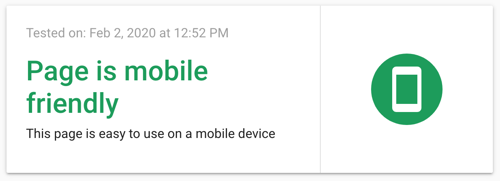
This test allows you to scan any website or webpage and find mobile usability and loading issues. These usability issues can be anything from JavaScript or html issues to buttons being too small or image issues. It is one of the most comprehensive mobile friendly tests out there and we utilize it on a wide variety of websites before launch. In fact, here’s the results from the page you’re looking at right now:

When starting from scratch or looking at a new website redesign, there are a couple of design focuses you should keep in mind. Let’s dive into our top 10 favorite responsive design tips.
The majority of potential customers and even many internal team members access your website on their phones. Thinking about your mobile design first and desktop design second will set you up for success.
Starting with a minimalist or flat design will do a lot to keep your website small and nimble. Not bogged down by overly-taxing animations, huge images, or unnecessary functionality, a minimalist design will help your users focus on content, instead of flashy web design that may cause mobile loading issues.
Though responsive framework isn’t a website design, it does a lot of the heavy lifting for you on the backend. These frameworks will allow you to build stunning, easy-to-use web pages that focus on content. Here are a few of our favorites:
Easy to implement, fun to optimize and design around, these responsive frameworks are a great starting point.
It’s no secret that mobile users physically use a website differently than a desktop user. The reduced screen space and lack of a mouse will change how a user clicks a button or plays a video. Learning these differences can be the key to your new website’s user experience.
Utilize Google Analytics or any other user experience testing tool to learn how your mobile users scan a page, click the links, or interact with forms. Just understanding how users navigate and interact will help you determine layouts, designs and sometimes even the actual content on your website.
We all love big, beautiful images on our domains as they allow us to show instead of tell, but as we previously touched on, when the images are too large or unoptimized, they can begin to bog down a website and cause them to be hindrances instead of sales tools. Optimize your images for mobile by reducing file sizes and minimizing dimensions as much as you can with tools like Optimizilla or Squoosh.
We briefly mentioned this before, but mobile users require a few more concessions when they’re interacting with your website. Buttons need to be larger, links need to be unique colors and differentiated from content, and clickable elements must look like they can be clicked.
Mobile-friendly testing tools will highlight these issues so you can fix them before launch instead of scrambling afterwards.
Nothing can be more frustrating as a user than quickly scanning down a page and finding the content you want to read, just to have a module at the top of the page finally load in and send the user to an unfamiliar section on the page. Minimize your website’s slow loading or pop-in animation modules to ensure that when a user is reading content, nothing gets in the way.
Your mobile navigation needs to be a sleek, optimized machine. Utilize short phrases and direct verbiage to identify major pages so your users can quickly assess your website’s navigation and find where they want to go.
Developmental technology has come a long way in the last few years. Responsive web design and responsive images were just the start as now we’re able to make text sizes responsive as well. Responsive text not only looks at the device the user is browsing on but can even detect the user’s preferred text size and display that.
While this can limit the things we can do with text and images interlacing, it provides your website with the ultimate readability.
During development you should be testing your domain whenever possible. Opening it on multiple devices and on different browsers will ensure all your usability measures are accounted for.
If you’re curious if your existing domain is ready for the mobile-first world or you want to start working towards a mobile-friendly domain, we can help. Contact our dedicated team today!
Go Back